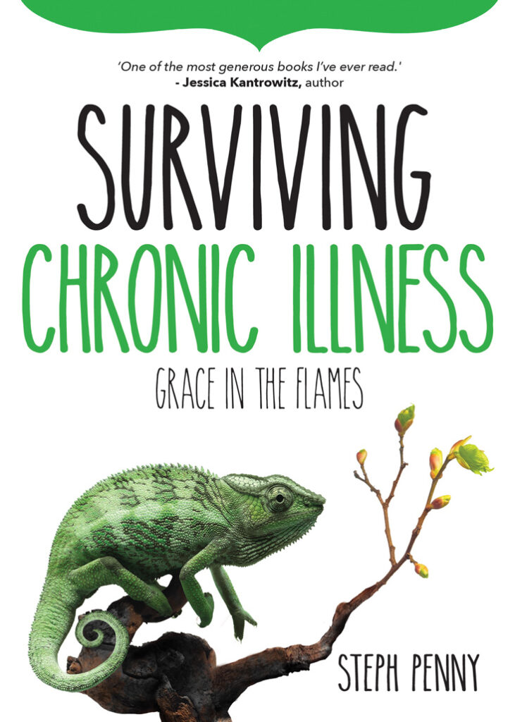
People have been asking me this week about the symbolism of the cover for my new book, Surviving Chronic Illness. This book is due out soon (watch this blog for announcements!) so I figured now is a good time to answer those questions. Starting with the chameleon.
The chameleon is a tricky creature. Just when you think you have it nailed down, it shapeshifts (or rather, colourshifts) into something else. You never quite know what you’re looking at with a chameleon.
Same goes for chronic illness. An illness that doesn’t get better, that is, becomes chronic, often morphs into something else over time: it changes symptoms, or gets worse, or gives you additional diseases with which you must contend. Or it constantly disappears and reappears before your very eyes.
Lupus, the disease with which I live, is known as the great chameleon. Because lupus can attack any organ in the body at any time, it often mimics other diseases or medical problems. You think you’re looking at a headache, or a rash, or a heart attack. But then it morphs into kidney problems, or dizziness, or liver failure. With lupus, you’re never quite sure what you’re going to get from one day to the next.
This makes the chameleon the perfect symbol for a book on chronic illness that also happens to share my lived experience of lupus.
The branch has meaning too. Not only is it a convenient perching place for our friendly chameleon, but if you look closely, you’ll see the base of the branch is a little burnt. Then, travelling along the branch, fresh green leaves are sprouting.
This is symbolic of bushfire. Many of us—especially here in Australia—know that bushfires are crucial for regeneration. It hurts like hell, and it causes much pain and heartache. Yet, after the blaze has burned itself out, the vegetation comes back to life again.
Regrowth is a major theme in Surviving Chronic Illness. It’s a beautiful thing when it happens. It doesn’t compensate for our suffering, but it’s a source of hope. It reminds us that after our lives have been ravaged by bushfire, good things can still happen.
Why use the colour green? Green’s purpose is twofold. Firstly, it’s a colour often associated with illness, as in someone ‘Looking green around the gills’, not to mention the nausea emoji. 🤢 But it’s also a colour that symbolises healing.
The leaves on the branch echo this theme. The signs of green reappearing after a bushfire evoke powerful imagery of the resilience of the human spirit, despite horrific circumstances. But it also speaks of God’s grace in the fire, that even when everything has been burnt to a crisp, regrowth is possible. The green is a promise of renewal.
It’s not easy being green—but there is always hope.
It’s not easy being green—but there is always hope.
Finally, let’s talk about grace. There is nothing easy about living with chronic illness or writing about it for that matter. Both require extraordinary amounts of grace. I realised, during the process of writing about and wrestling with chronic illness, that survival is nothing to do with me. It’s completely to do with God’s grace.
Grace holds us in every difficult circumstance, every weak moment, every emotion from triumph to despair. It’s only grace that gets us through. The book begins and ends with grace, so I thought it fitting to give it a place in the subtitle. It’s a not-so-subtle hint about what readers will find within its pages.
If you read this book when it comes out, I hope you find that grace—and it finds you.
What do you think of this cover? What do these symbols mean to you? Do you know someone who might benefit from a hopeful (and slightly quirky) book on chronic illness? Share your story. Let’s have a countercultural conversation.